July 27, 2015

Maggie Holmes Confetti + Disneyland

Nancy Damiano | Maggie Holmes Confetti scrapbook page

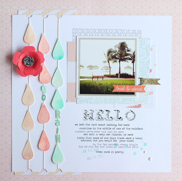
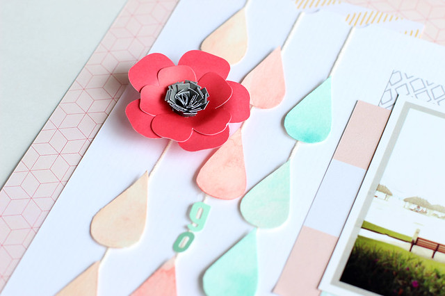
COLLECTION | Maggie Holmes Confetti + Crate Paper Craft Market

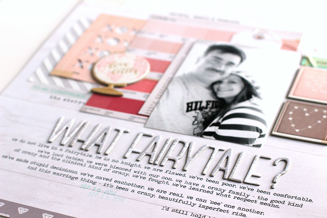
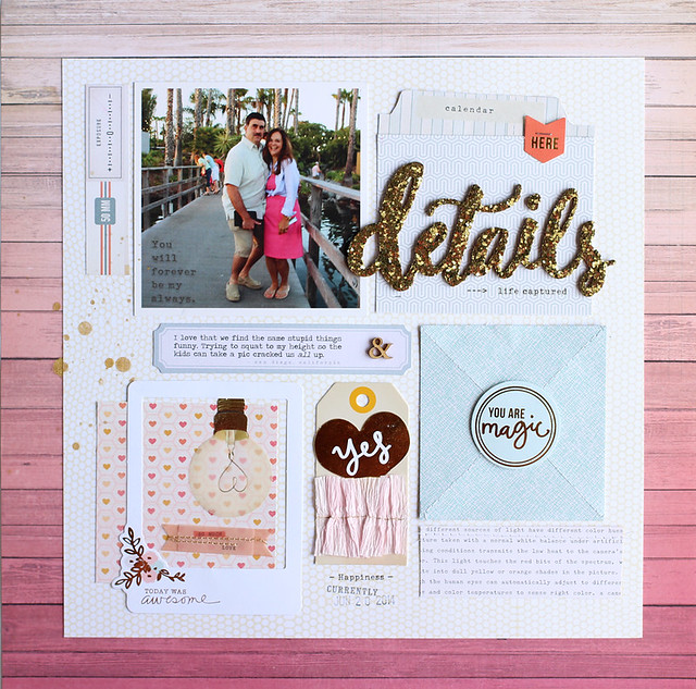
STORY | This family selfie was taken right at the start of our first day at Disneyland. I wanted to remember this perfectly happy moment. Because anyone who has traveled with three kids under 8, knows these moments are fleeting and rare. I wanted to capture that feeling of being excited to get our vacation started – but still stay true to the reality of families and vacations.
DESIGN |  Confetti and Craft Market are a match made in scrapbook heaven. They both have a nice soft feel and neutral patterns that are great for any story you want to tell.
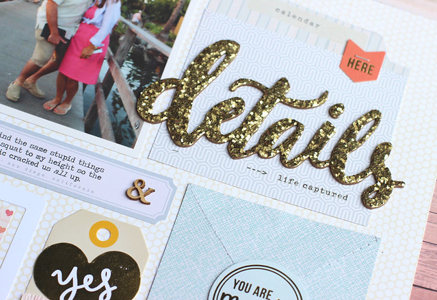
I started the design with a base of patterned paper. I loved this paper so much, I wanted to use it all! I chose my favorite patterns and layered them in a cluster right in the center. To give the photo a little lift, I placed a chipboard frame just underneath. Adding some chipboard to the edges of the frame adds a punch of color and shape to the space.
Pattern7
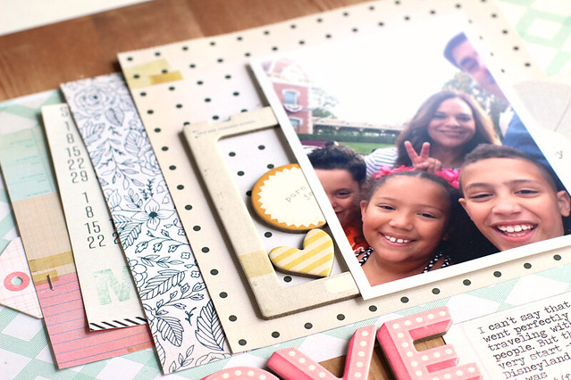
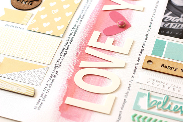
I love how the bright pink LOVE title stands out from the softer feel of the background. It adds just the right amount of pop to the center of the design.
The final touches include a little diagonal smattering of flair and wood pieces that ground the journaling space.

This was fun to create + a real story I want to remember.

July 23, 2015

Event9

COLLECTION | Crate Paper Kiss Kiss
STORY |  This layout started with a favorite picture. A selfie of my husband and I from this past summer. It was a gray, misty morning on the beach and the photo has this dreamy quality to it. That got me to thinking about our impending anniversary and the path that led us to here and now. It’s been good, but this has been no fairytale. I like real stories and real life, so that’s what I journaled about. Some warts, some great things and the sentiment that I would still do it all over again with him.
DESIGN |  I began the layout with the color chip sheet of patterned paper from the 6×6 paper pad. The color gradient and simplicity of the design make it a favorite. From there, I layered a die cut journaling card, some chipboard, stickers and tags to create the center of the layout.
Event10

I framed out the photo by using two square chipboard frames in pink and gray. This keeps my photo front and center despite all the layers and embellishments surrounding it. The story is important here so I went with a bold, large title smack in the center. I like how these Thickers are a neutral, white and gray woodgrain and keep the bottom of the layout mostly white.
I’ve been playing with very soft colors lately which is a big change for me. I love the ethereal look of white pages and soft colors. It’s a phase.  I’m sure I’ll be back to my usual bold palettes on the next round of layouts, but for now I’m enjoying it!

July 22, 2015

Elle's Studio Cienna + Paint

LoveYou2

COLLECTION | Elle’s Studio Cienna

STORY | Documenting my son’s personality at age nine. Some of his strengths and improvements and things that drive me crazy.:)
DESIGN |  I started with the idea of arranging elements by color. There are two dominant colors in the Cienna collection that I love – buttercup yellow and mint. I added the splash of pink down the center to emphasize the title.
LoveYouPink
To create the painted ombre effect in the center I used the Jillibean Happy Hues paint in Precocious Pink and then a simple line of mango Gelato paint that I blended into the acrylic paint. This painted base makes the large white title pop.
LoveYouYellow
The yellow and mint sides are filled with bits and pieces from the Cienna collection, exclusives from past kits (cork, acrylic and flair) and 4 rectangles of patterned paper.
LoveYouAqua
Separating elements by color is a fun way to include an eclectic mix of supplies on a page and frame a favorite photo!

July 20, 2015

Watercolors + Kits

HelloRain collection | Scraptastic Darlene Kit - April 2015

story | I used the Darlene Kit and Add-on to create this page about a vacation moment. It rained every single day while we were in Florida and I remember taking this picture during the daily monsoon. 

design | I hand-cut the raindrops and the used watercolors to add a nice soft look to the shapes. Using watercolor paper was really important because the shapes remained sturdy even after adding water and paint. After letting them dry for a free hours, I strung them to make rows of colorful rain. Adding a large flower and some text added a pop of color and texture to the strands. 

HelloRaindetail The Darlene kit has a beautiful range of colors in coral, mint and gold. Colors and a feel that I would probably never put together on my own. That's what I love about kits, they push me to stretch creatively!

July 19, 2015

Maggie Holmes Open Book + Gossamer Blue

DetailsCali

COLLECTION | Maggie Holmes Open Book + Gossamer Blue
STORY | Documenting a silly little picture. My niece had the big camera and was trying to take a picture of us. She kept telling me that I was way too short for my husband and that I should try to stretch a little. This cracked us up. And the shot she got was one where my husband was trying to come down to my level. It's oh so silly and very us.
DESIGN |  I started with the idea of arranging elements in a grid. I started with the 4x4 photo and built around it. Using die cuts from the Open Book collection and layers of patterned paper gave me a simple but interesting frame around the photo.

Detailsdetail
My favorite detail is this glittery title sticker from Crate Paper. I love the fancy font and little bit of whimsy that it adds to the page.

This is one of those ordinary (but funny) memories from our California that I want to remember.

July 18, 2015

Maggie Holmes Kiss Kiss & My Stella

Stella2

COLLECTION | Crate Paper Kiss Kiss

STORY | This is a favorite photo of my youngest niece, Stella.  From her little pinky in the air to the beautiful long lashes, this image is the epitome of dainty baby girl. It’s exactly who she is today at 2-1/2. I journaled about her personality and how much I looked forward to watching her grow up.
Stelladet2
DESIGN |  Kiss Kiss by Crate Paper is all about soft colors and patterns. It was perfect for this photo + story. The base of the layout is a pretty watercolor pattern that starts out strong at the top and gradually fades to white. Following that design, I kept all the color and pattern at the top of the design and the neutral black and white photo at the bottom. This created a natural line between the embellished fun part of the design and the main story/photo parts.
Stelladetail1 I I love adding meaningful little details to my pages. Here, I took advantage of Stella looking down and out of the photo, by adding a rub-on that states “it’s the little things” in her line of view. Adding a chipboard arrow, date stamp and enamel dots keeps the detail from getting totally lost on the page.

Details, Kiss Kiss + Stella Bella are close to my heart! xo

July 15, 2015

Choose Happy Nico

So my life recently changed like life tends to do. Nothing good or bad stays the same. It's something that resounds with me. And life keeps showing me so.


We started in the ER for a suspected stomach flu. He couldn't keep anything down. But it was this weird shallow breathing thing that he was doing that made the hairs on the back of my neck stand. It was subtle, but there was something about it that set off the Mom radar. I knew there was something wrong.

Blood glucose levels at 500 and a dangerously low oxygen saturation rate. Diabetes Type 1 and diabetic ketoacedosis they said. The bad type of diabetes, the kind you can't reverse. An emergency transport to Children's Hospital of Philadelphia and straight to the Intensive Care Unit we went.

I want to say that it was the most frightening experience of my life. But it wasn't. I did this already. He was born at 28 weeks - a micro preemie. We spent the first three months of his life in the neonatal intensive care unit. I've had my turn on the chronically ill child carousel. But nothing good or bad stays the same right?

So here we are learning to adjust to a new way a life. I have a 9-year-old with a chronic illness and a body that does not work.  No matter how pretty the picture the diabetes community wants to paint me, he will never know what it is to have a completely healthy body. He is 9 freaking years old. I have a hard time wrapping my mind around that. The hardest moment was when he asked, about two weeks in, "hold up Mom, you mean I'm still going to have this when I'm an adult?  No no no Mom, I want to take insulin and get better." I wish it worked that way kid.

I've always believed that happiness is a choice. I've raised him on, "Nico, choose happy."  Life hands us all bags of good and beautiful and ugly. How well you carry those bags define you and are the difference between a happy life and one filled with bitterness and discontent. Everybody gets crap. Shake it off, get up and choose happy.

I made this layout two months before Nico got sick. I have it hung up in my scrap room now to remind me. Because there are days that I'm completely overwhelmed and I want to scream and set my damn hair on fire. There is sadness and worry and anger. But big eyes are watching me. He is oh so attuned to my attitude about this. He will be my reflection. And so - I keep getting up and choosing happy.

Because I want him to be happy.